Rhea – Designing for the Body’s Wisdom
Project 02
Completion Date February 2025
Project Type: Personal UX/UI Concept
Tools: Figma, Mockuuups Studio
Duration: 4 weeks
Overview
Rhea is a mobile app concept designed to support and celebrate cyclical experiences through mindful, minimal, and emotionally intelligent UX/UI. Focused on period tracking, Rhea offers users a safe and elegant digital space where their personal data is treated with care, and their journey is met with empathy.
This is a self-initiated design project, created independently to explore meaningful, user-centered experiences in femtech.
The Problem
Most period tracking apps either over-simplify the experience or rely on impersonal, medicalized designs — often forgetting the emotional nuance and personal nature of the cycle. Many reduce the user to data points, missing the opportunity to create a space of comfort, care, and presence.
Rhea reimagines this experience with softness, intentional beauty, and poetic interaction — proving that thoughtful design can be both gentle and powerful.
Design an app that:
Feels like a trusted companion, not a tool.
Honors the personal and emotional nature of cycles.
Offers intuitive, calming interfaces with a sense of ritual.
Collects only what’s needed — and holds it with respect.
The Goal
Visual Design
Typography: A balance of soft serif and modern sans-serif
Colors: Soft pinks, lilacs, and warm gradients to evoke safety and softness
Tone: Poetic, calm, respectful
Copywriting: Every word was chosen with intention — from onboarding to insights — to maintain a voice of care and presence.
Research & Inspiration
I explored:
FemTech competitors (Flo, Clue, Natural Cycles)
Inclusive and trauma-aware UX design
Color psychology and typographic storytelling
Key insight: users crave empathy, privacy, and beauty.
User Flow
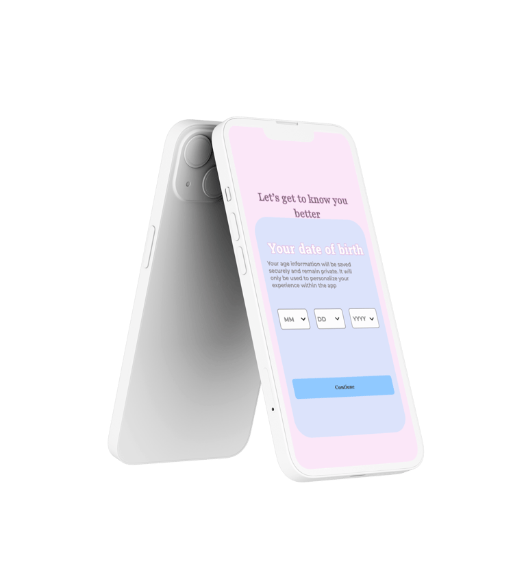
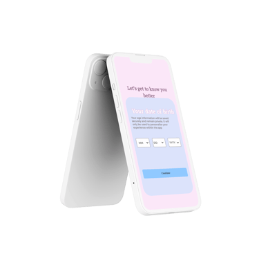
Welcome & Onboarding
Birthdate input (framed as personalization, not data grab)
Cycle insights setup — regularity, duration, last period
Emotional microcopy: e.g. "Rhea listens, softly."
Dashboard: A clear, intuitive visual of the current cycle
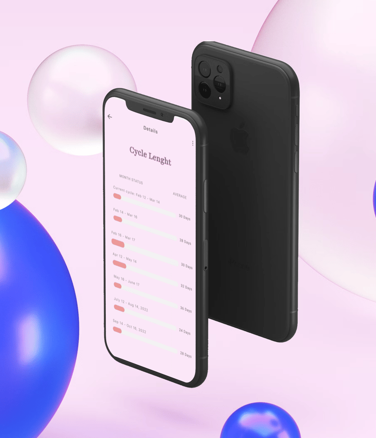
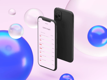
History & Details: Clean calendar with past periods, cycle length visualizations


Design Highlights
Circle UI to represent current phase with gentle animation
Soft form fields and rounded UI for a calming interaction
Subtle animations and poetic feedback after input (e.g. “Held in care”)
Outcome
Rhea became a space that doesn't just track — it listens. The design brings softness to something deeply personal, creating space for users to feel seen, respected, and in tune with themselves.
Reflection
Through Rhea, I explored what it means to design for bodies, not just users. I learned to slow down, to listen through color, typography, and flow. This wasn’t just UI work — it was emotional architecture.
"With every detail you offer, Rhea listens softly. Held in care. Protected in trust."